
You data has been uploaded into SpatialKey, you’ve had your first cup of coffee, now it is time to open your first dashboard!
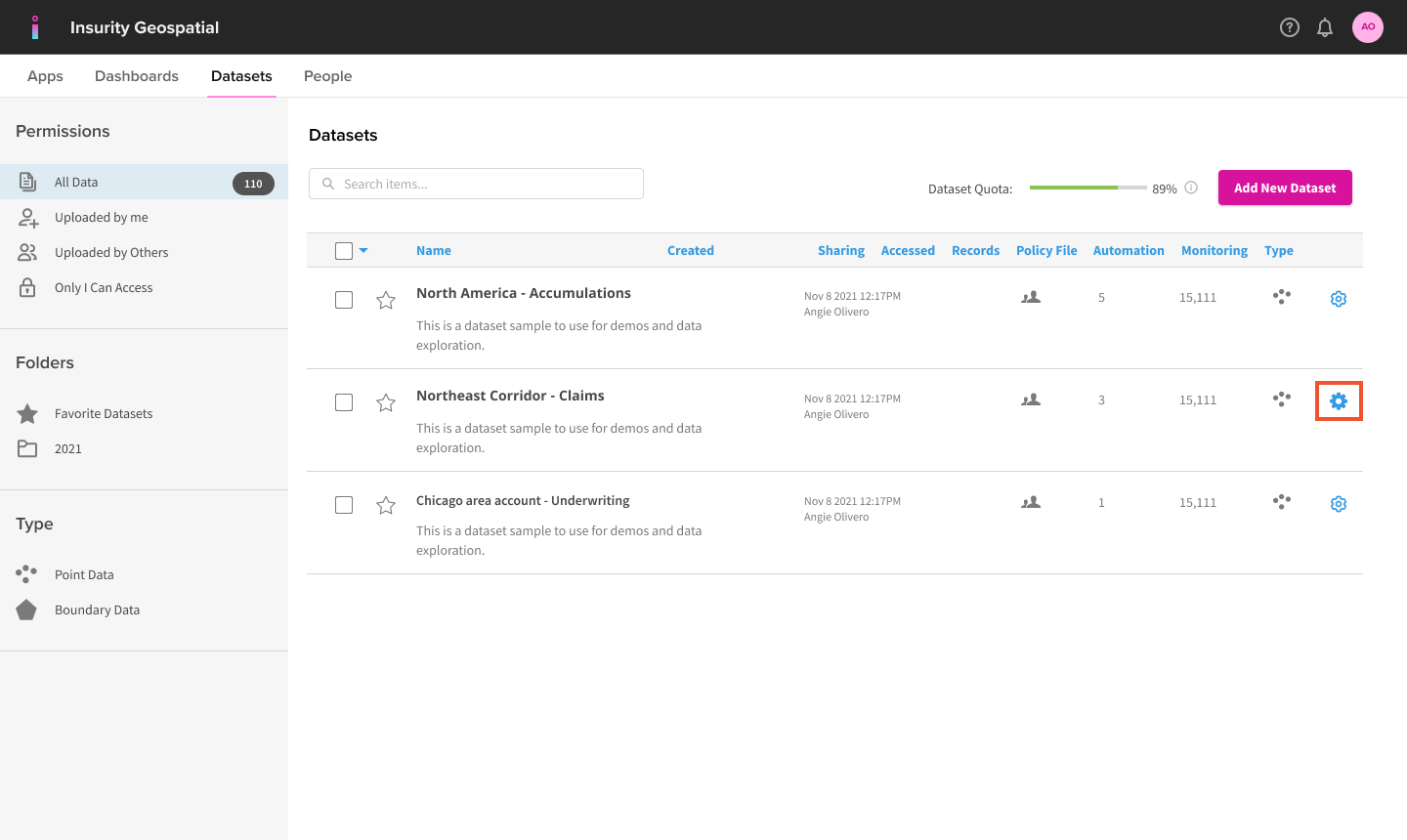
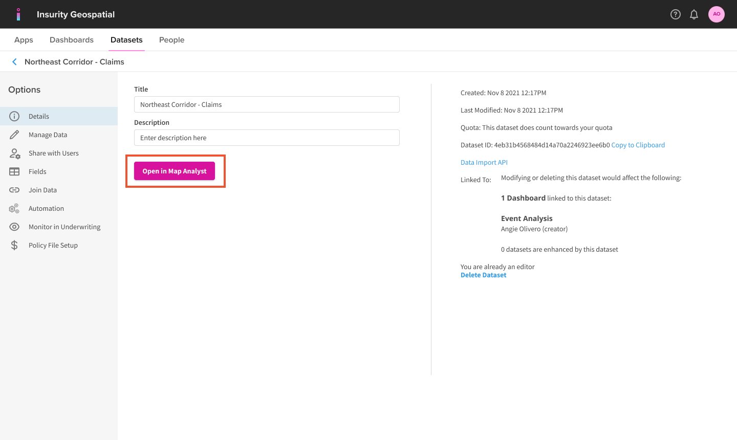
Find your dataset in the Datasets tab and click on the gear icon to view data settings, then click to “Open in Map Analyst”.
Select how to visualize your data in the dashboard.
- Heatmap, Points, and Circle Cluster maps create clusters of your records so you can see where the densest areas are on the map.
- Thematic Shapes maps render your data by geographic shapes, such as states, or zip codes.
That’s all there is to launching your first dashboard. Don’t sweat the options because you can easily change how your data is visualized from the Layer Manager within the dashboard.
Check out Navigating the Dashboard and Adding Visualizations for some tips on interacting with your dashboard.