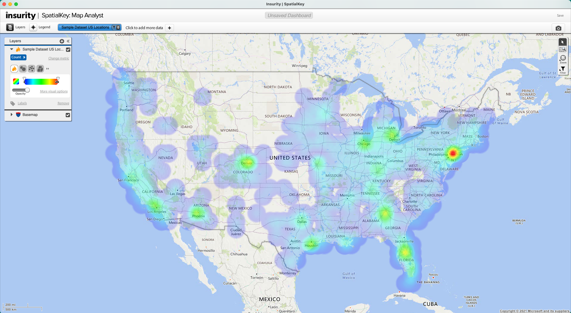
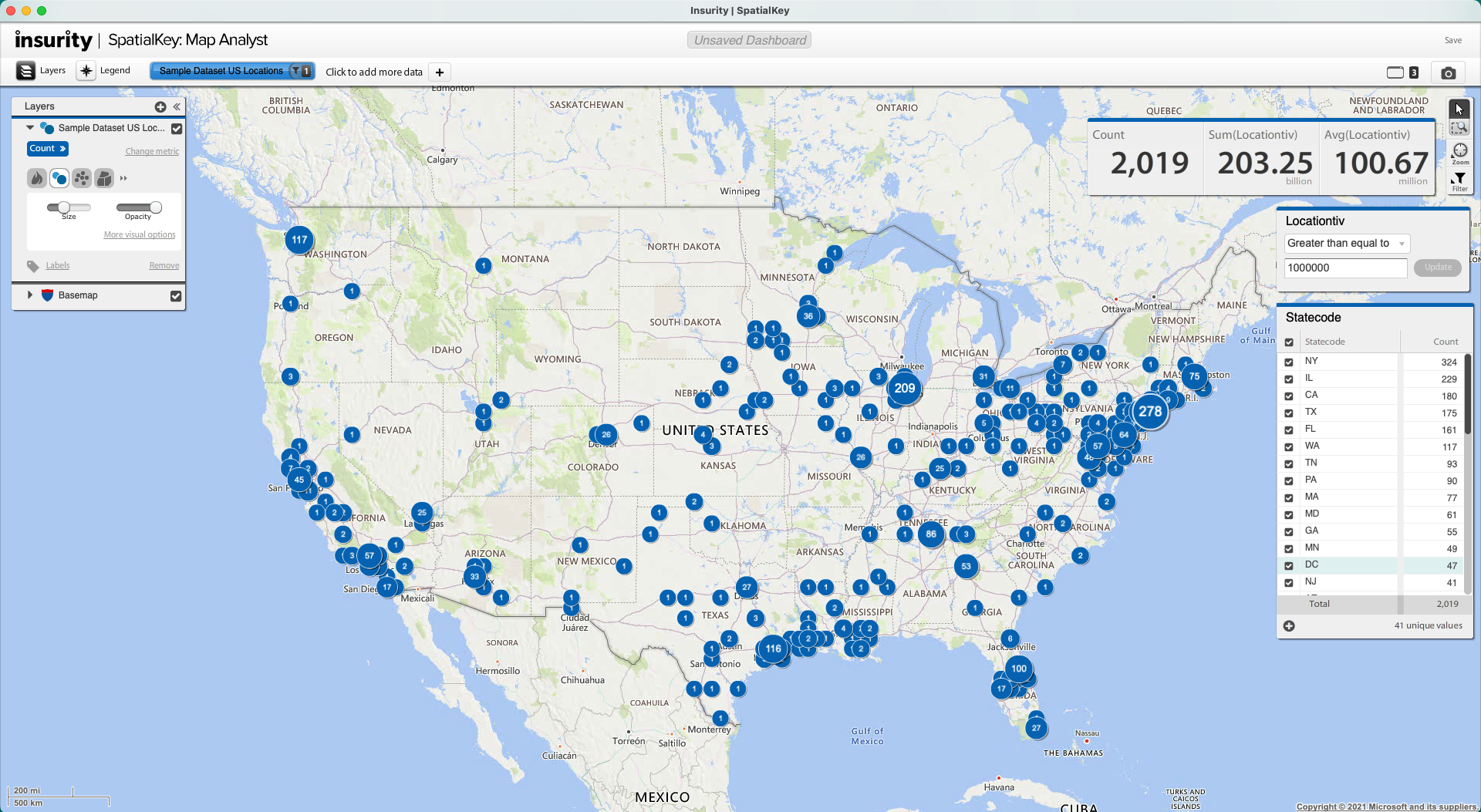
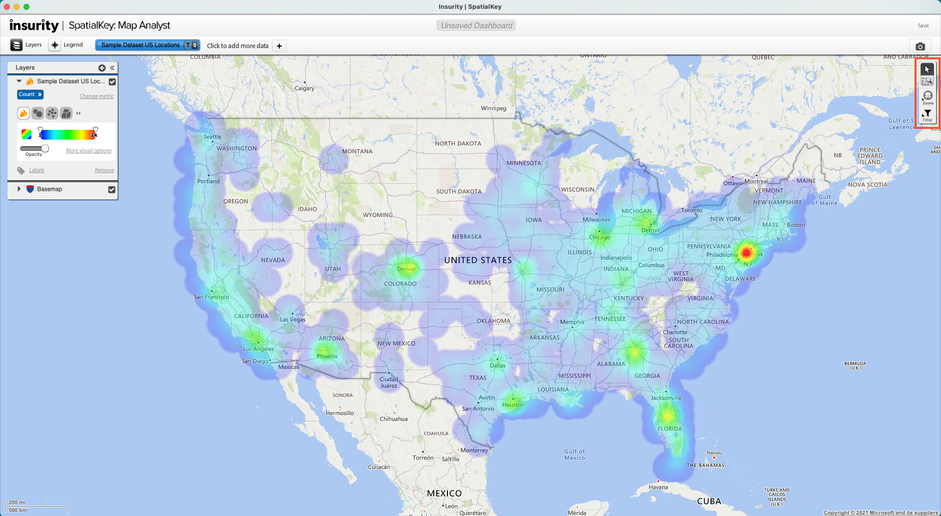
Your first dataset is loaded, your first dashboard is open, now it is time to explore your data with SpatialKey! When you first launch a dashboard, you will see your data rendered with the selections you made when setting up the dashboard. In the Dashboard, there is simply a control bar, map layer manager, and map controls.
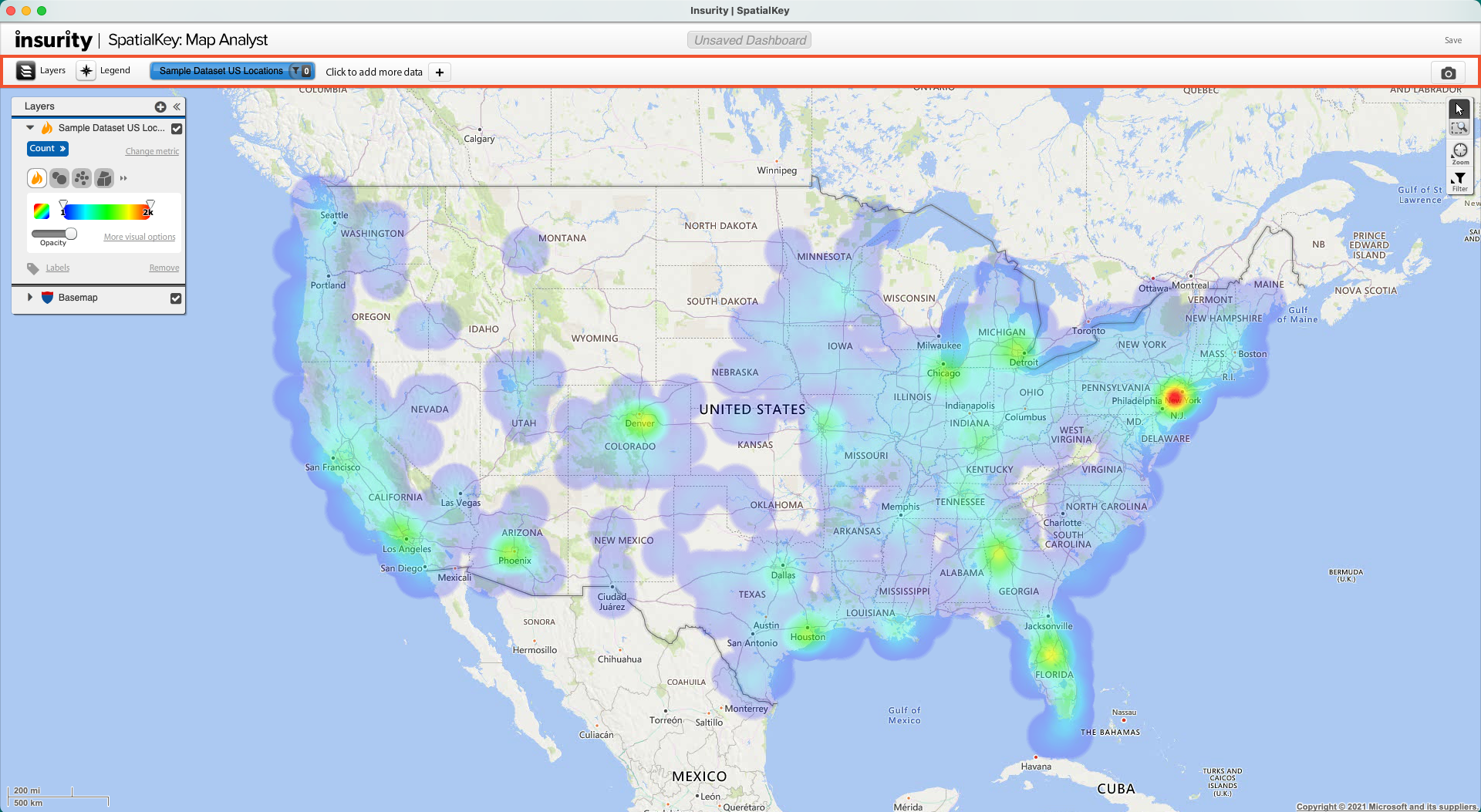
Control Bar
The control bar is where you add and manage datasets, hide or show the layers pod, and hide or show the legend.
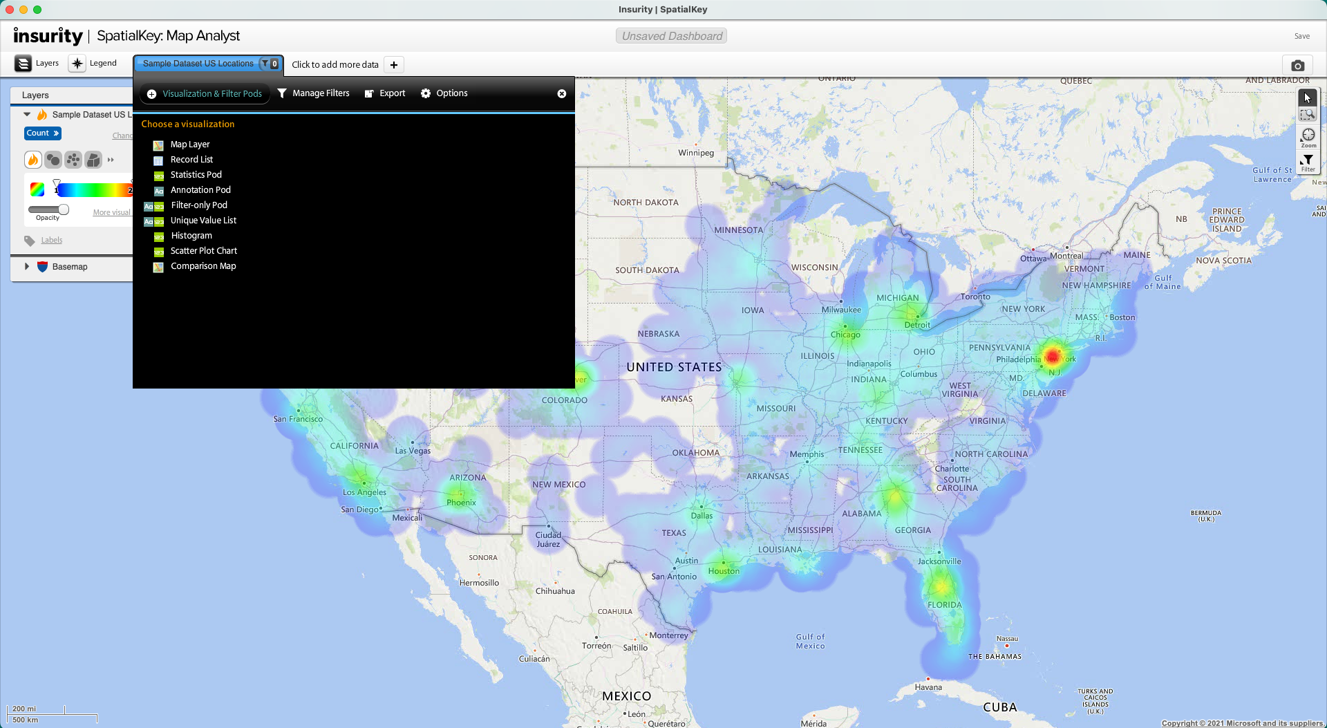
Dataset Configuration Panel
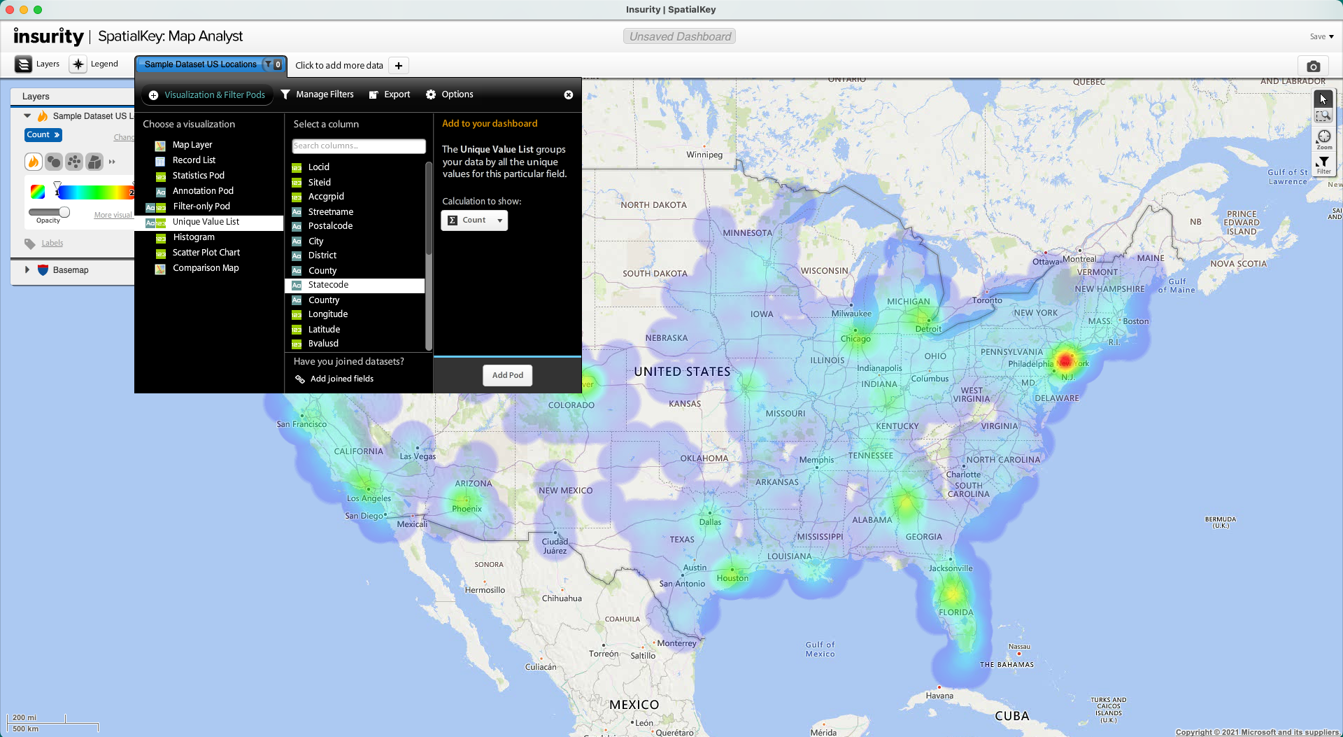
This panel expands down when you select a dataset in the report control bar. You can manage filters, export, and remove data in this panel. Most commonly, you will use this panel to add pods to your dashboard.
Adding Pods to your Dashboard
Choose a visualization to add to your dashboard. In the image below, we are adding a Unique Value List pod showing the count of records by unique “statecode” listing.
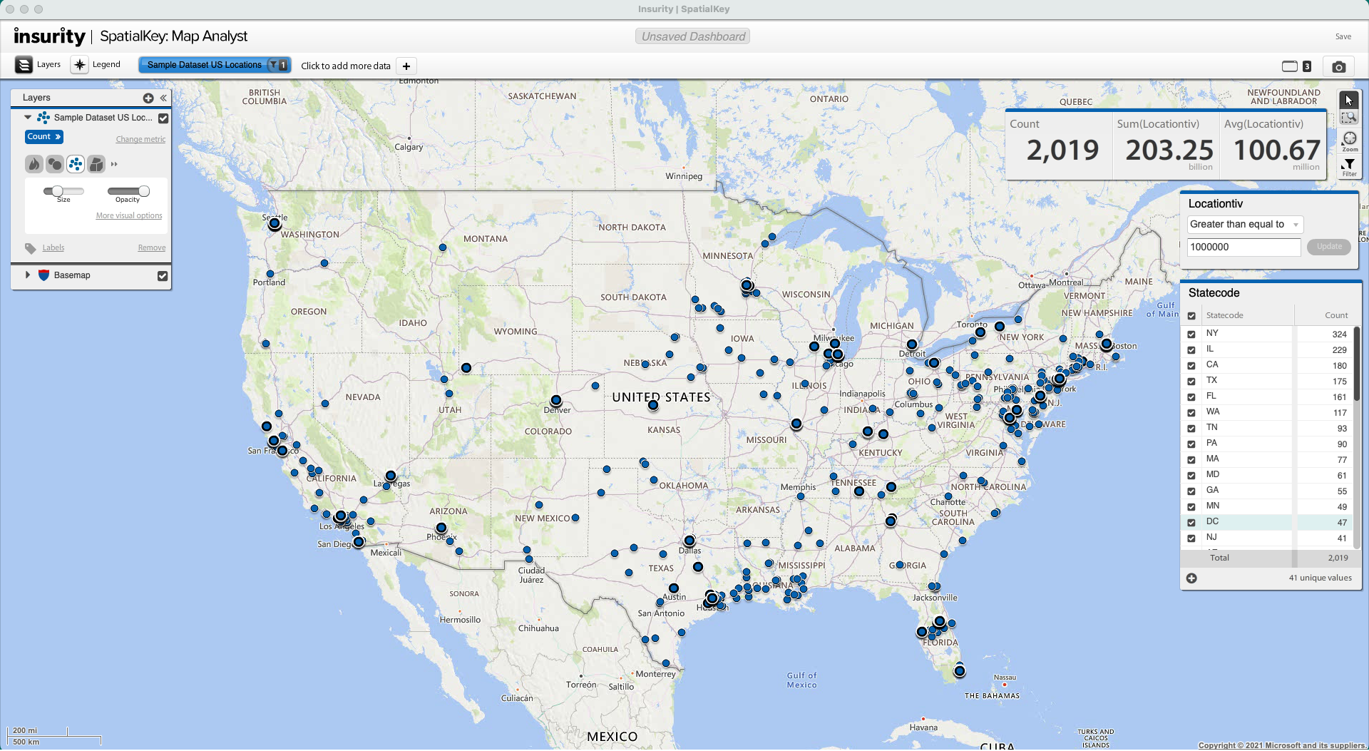
 Add a few pods to your dashboard, and rearrange them by dragging them around the screen. In the example below, three joined statistics pods, a unique value list and a filter have been added to the dashboard.
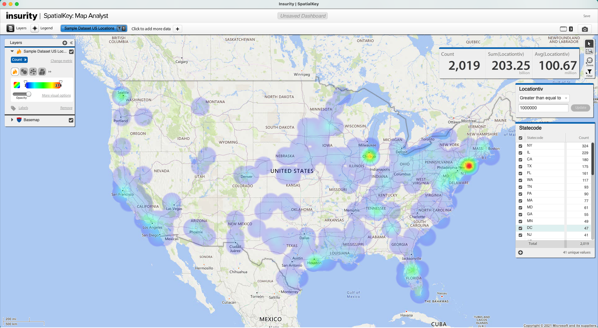 All visualization pods in your dashboard will work together to stay in sync as you filter and explore your data.
Pod Manager
The pod manager appears in the control bar once pods have been added to your dashboard. Use the pod manager to view a list of all maximized and minimized pods.
Map Layers Manager
The Map Layer Manager is where layering and display of datasets is controlled.
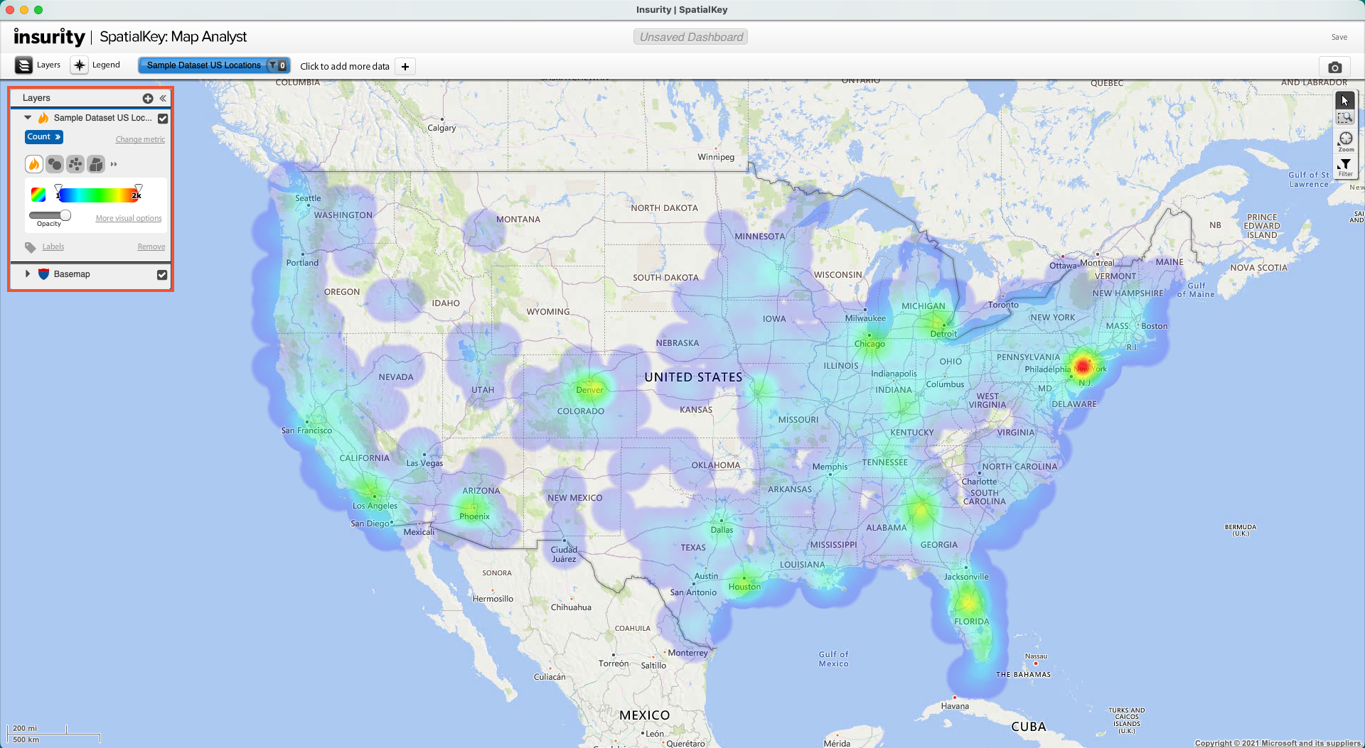 Change from a heatmap to display individual point locations. Also try graduated circles to show clusters of records – the size of the circle represents the value at that geographic location.
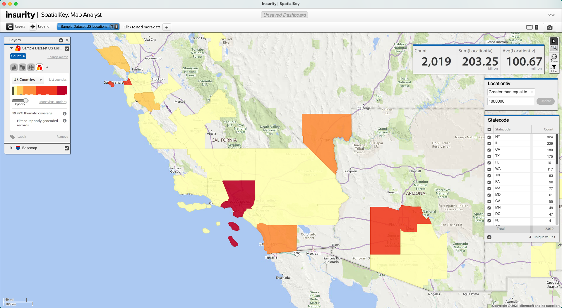
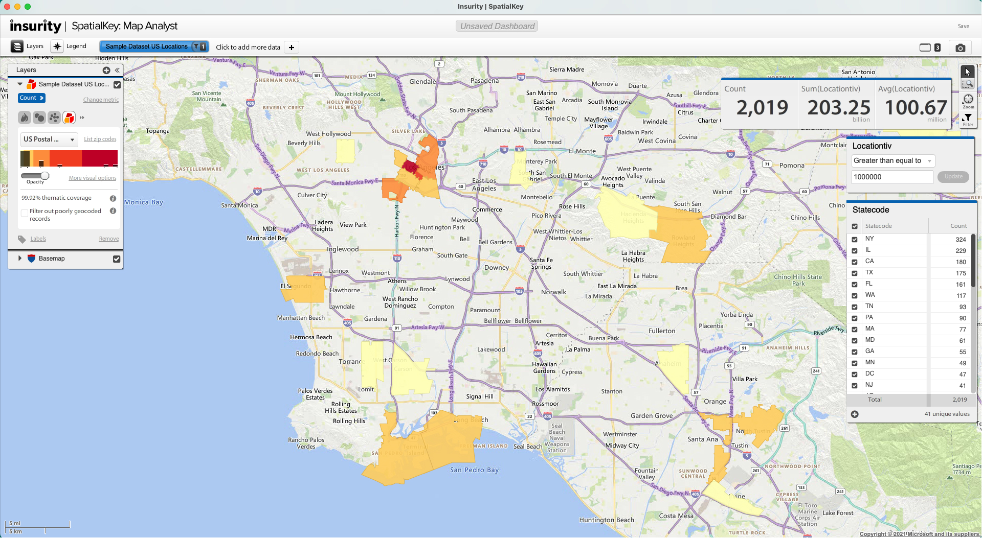
Change to a thematic map to render your data by geographic shapes, such as states, or zip codes.
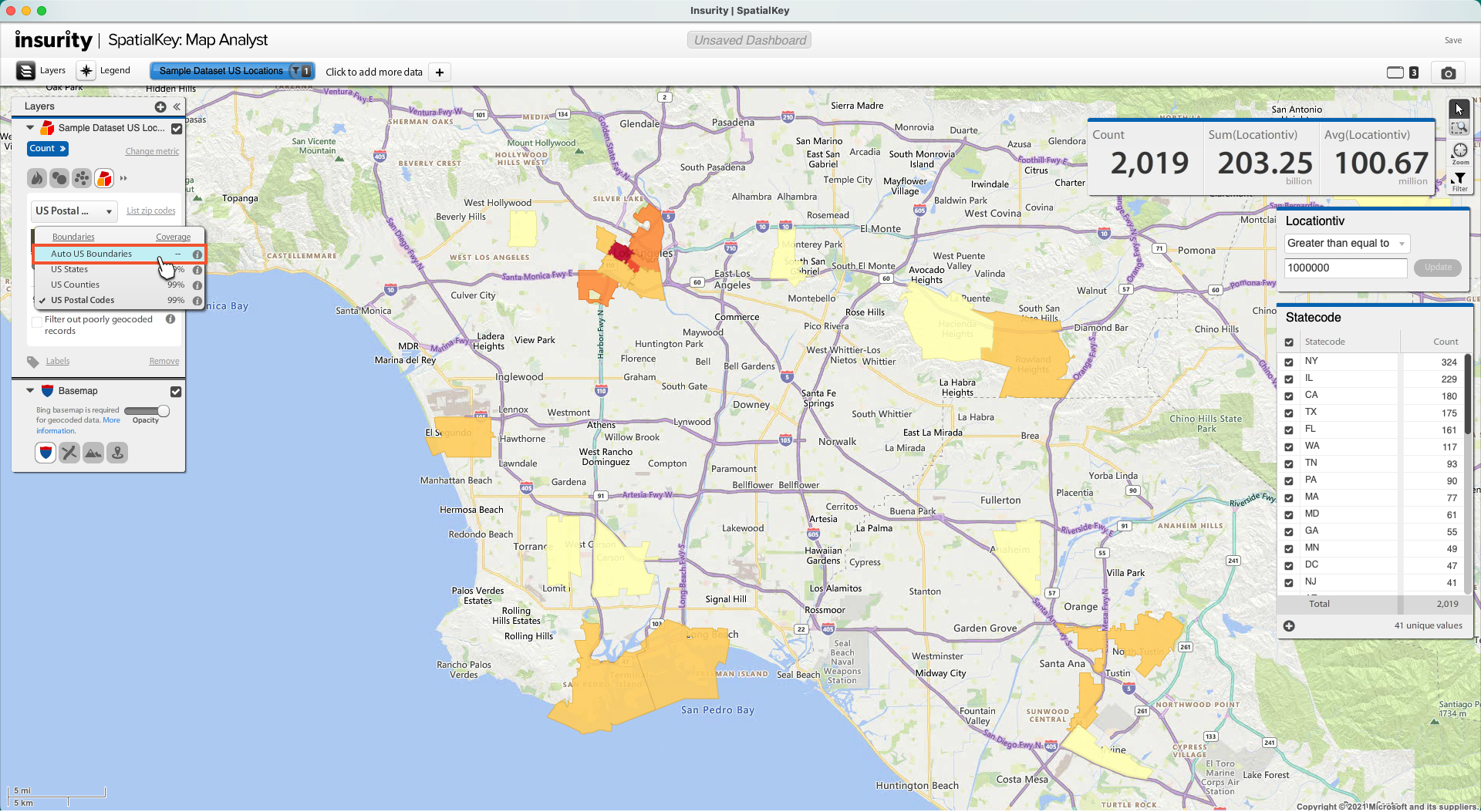
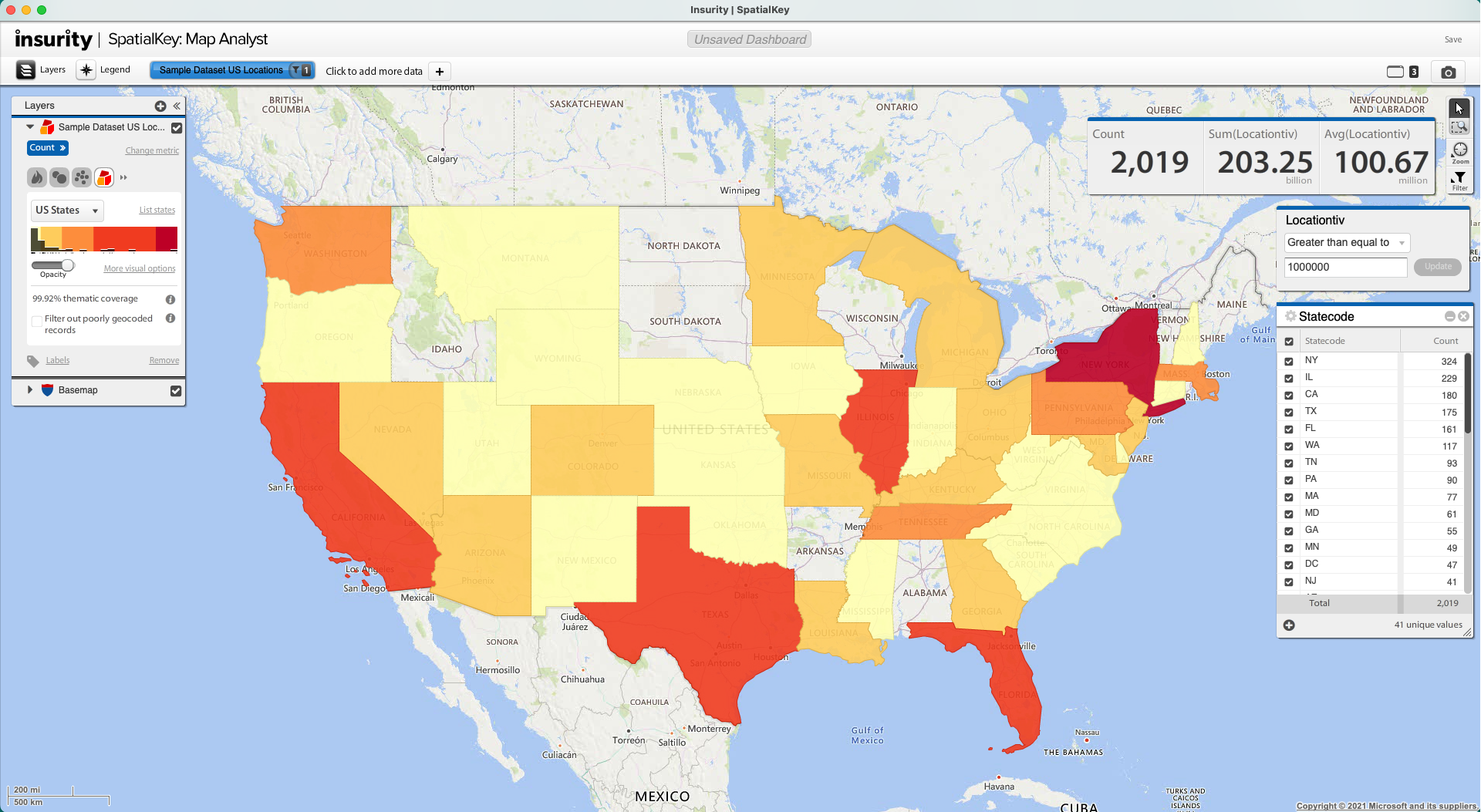 As you zoom into your map, the thematic boundary is automatically adjusted to provide you with the most optimal view of your data.
If you want to override the default settings for your given zoom level, you can do so via the Map Layers Manager. Re-select “Auto US Boundaries” to undo your manual override of the automatic adjustments.
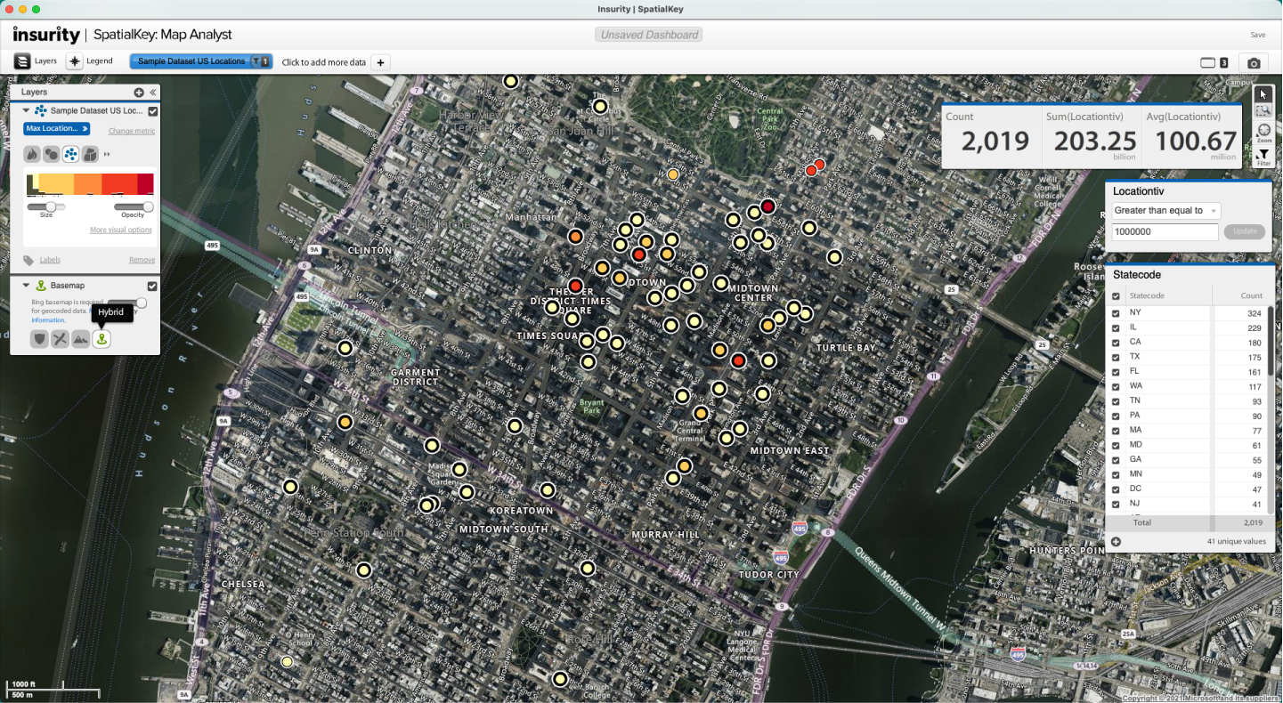
 Control which basemap you are using and edit how it renders. When viewing the Bing basemap, you can change the view to Street, B/W Street, Satellite, or Hybrid map styles. Try out the B/W style to let your data shine without distraction from the map layer or try the satellite style to give your map a rich looking background.
Map Controls
Map controls allow you to select, pan, zoom, and enable filters by area in view on the map. When you enable area filters, you are automatically filtering the other pods in the dashboard by the visible area on the map.
Save and Share
Once you are done creating your first dashboard, don’t forget to save and/or share it with others in your organization. Note that if you share you dashboard with others, they must have permissions to the datasets used in the dashboard in order to view the dashboard.
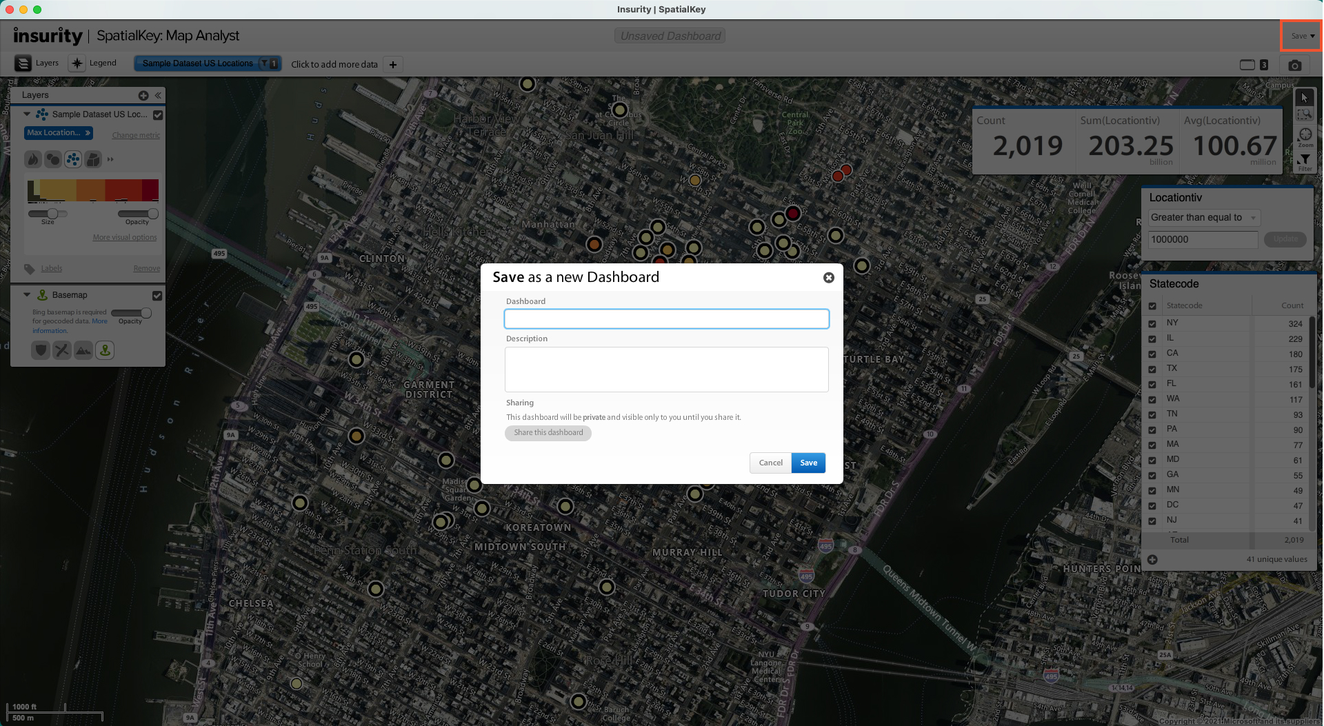 If you would like a cheat sheet on what you have learned in this article, check out Dashboards in the Quick Start Guide.

