| Note: This feature is available in SpatialKey Client for Windows applications, i.e., Map Analyst, Hazard Analyst and Accumulations. |
The legend provides context to what you are viewing in your dashboard. Let’s walk through some examples of how the legend appears when different layers are included or excluded from your map or when your layers are rendered using a different visualization method.
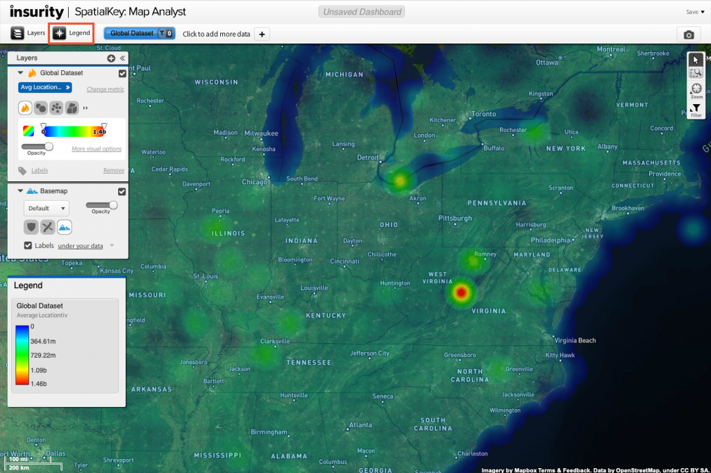
Toggle the legend on or off using the top toolbar.

In the image above, the legend is showing the “Average Locationtiv” for the heatmap layer. See how the values range from $0 to $1.46b. This tells us that where there are red concentrations, the average value is around $1.46b.
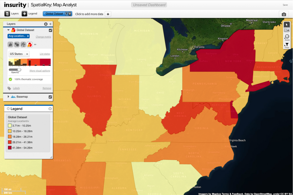
As you change the rendering method for your layer, the legend will update. In the example below, we changed from heat map to thematic map so we can view the average value in each postcode. For more details on how to change the rending method for your data, check out the layer manager article.

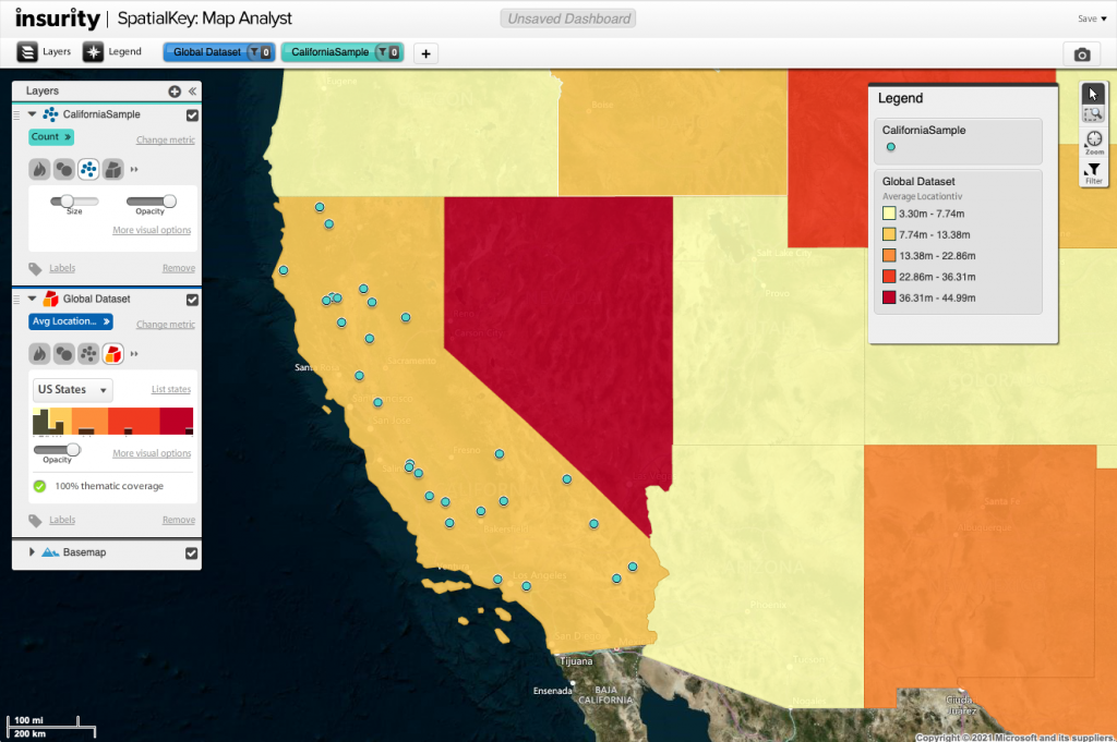
As you enable more layers on your map, the legend will update to show details for them. In the example below, we added a point location visualization for the other dataset in the dashboard.

Also, you can enter the legend settings to enable or disable certain elements of the legend.
That’s all there is to using the legend. Don’t forget to toggle it on before grabbing screen captures to help provide context to what your map is telling you.
