
Visualize and Understand Results
1. You’ll initially see a Summary Report of your risks based on all hazards enabled for your analysis. This report provides high-level information for where to focus your analysis. You can:
- A) Visualize impacted locations and hazard extents.
- B) Quickly identify impacted locations, policies, insured value, and gross (or net) exposure by severity band.
2. With the map, you can visualize the various hazard layers and your impacted portfolio locations in a single place.
3. A list of impacted portfolio locations is available, enhanced with hazard information that you can sort and filter to enhance your analysis.
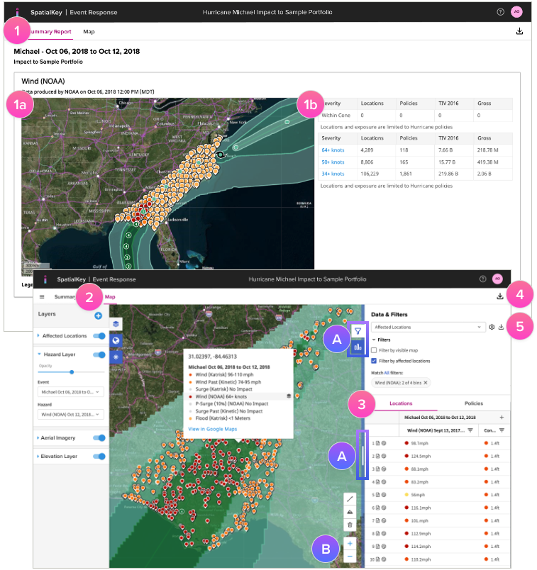
Download Reports
4. Download a ZIP file of impacted locations & policies enhanced with hazard information along with the shapefile event footprint data.
5. Separate files of your locations, policies, and unique value lists can be downloaded as CSV files.
Note: Both sets of data will reflect any filters or changes made to the dataset.
Was this helpful?