
This Layers, Base Map & Legend article will show you how to control how your data appears on the map. You can add new layers, turn layers on or off, adjust opacity, and use advanced visualization options to change how points are displayed—such as individual points, graduated circles, heatmaps, or thematic views. You can also customize colors, shapes, sizes, and bin ranges, and color data by any column to highlight patterns or key metrics.
You’ll also learn how to switch between different base maps (like satellite or street view) and enable elevation contours for added context. The legend updates automatically to explain how your data is being visualized, helping you quickly interpret what you’re seeing on the map.
Layers

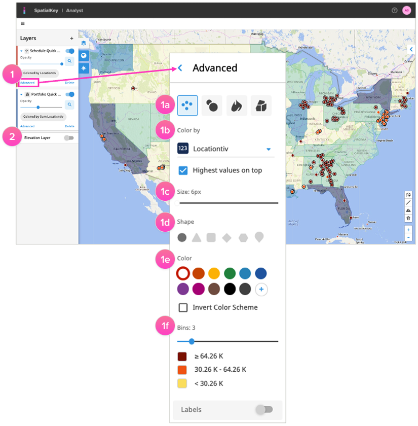
Use the layers to adjust the visualization of your data. Add new layers (using the “+” icon), toggle the layers on/off or adjust the opacity of layers to make different elements stand out on your map. You can even add the same dataset twice to filter and compare using different visualizations of each.
1. Use the Advanced options to adjust the visualization of any point dataset in your dashboard.
- A) Visualization Options: Point datasets will have 4 display options: individual points, graduated circles, heatmap, and thematic.
- B) Color By: Color your data by any column on your dataset e.g., TIV or City. When visualizing by graduated circles, heatmap, or thematic, only aggregate numeric values will apply.
- C) Size: Adjust how large points render.
- D) Shape: Select from 6 different shapes when viewing your data as individual points.
- E) Color: Select from various preset color family options or create your own with the “+” icon.
- F) Bins: Select from between 2 to 9 bins to color and group your data.
2. Enable the elevation layer to view global contours.

Base Map
Adjust the base map visualization from satellite to street view. If you have more than one base map enabled, you could switch between them here.

Legend
The legend helps you make sense of all the data that is being visualized.
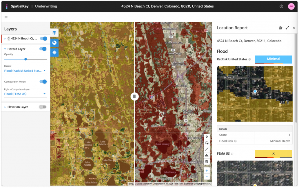
Underwriting
The Underwriting application has a few app-specific features in the Layer panel including:
- The ability to change the hazard layer visualized on the map
- Enable comparison mode to visualize two different hazard layers side-by-side, helping you compare two different models or points in time in the same view
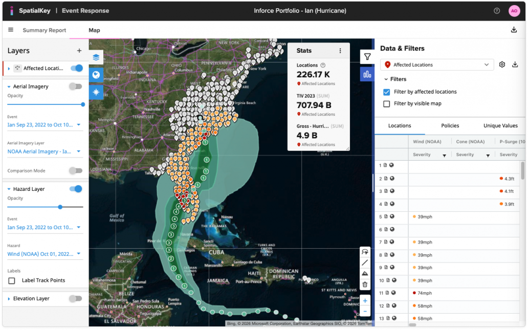
Event Response
The Event Response application has a few app-specific features in the Layer panel including:
- The ability to change the hazard layer visualized on the map (when visualizing NOAA Hurricane, there is also an option to Label Track Points on the map)
- Enable the aerial imagery layer if available
- Enable comparison mode to visualize two different hazard layers or aerial imagery layers side-by-side, helping you compare two different models or points in time in the same view
Was this helpful?