
This Filtering Data article explains the different ways you can narrow your dataset to focus on what matters most. You can filter using data attributes directly from location or policy columns, apply filters by the visible map area, or use filter chips to quickly review and remove active criteria. Filters can be combined across multiple columns using AND / OR logic for more precise control. Analyst-Quick-Start-Guide
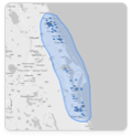
You can also draw custom shapes on the map—such as circles, rectangles, polygons, or freehand lassos—to filter data spatially. These tools let you analyze locations within specific boundaries, measure distance, area, or perimeter, and easily edit or clear shapes as your analysis evolves.
- Filter by Drawn Shapes: When drawing custom shapes, this checkbox allows you to easily toggle to filter by the shape or not.
- Filter by Visible Map: You can select to filter by visible map which will limit the locations in the List Report to only those visible on the map. This is helpful in keeping the List Report in sync with what you are currently visualizing.
- Filter Chips: Filters applied from data columns will display as chips that can be removed here.
- Column Filters: Use the column filters from your location or policy file (if available) in the List Report to narrow down your locations. Apply filters across multiple columns and then set the filter to require ALL or ANY of the criteria to be met (e.g. “and” vs. “or”).
- Custom Shapes: Draw custom shapes to filter your data, show the square feet or miles and, where relevant, radius, distance, and perimeter.
- Click individual shapes to edit, drag them to a new position, or hit the delete key to remove them.
- Use the trash can to clear all drawn shapes at once.
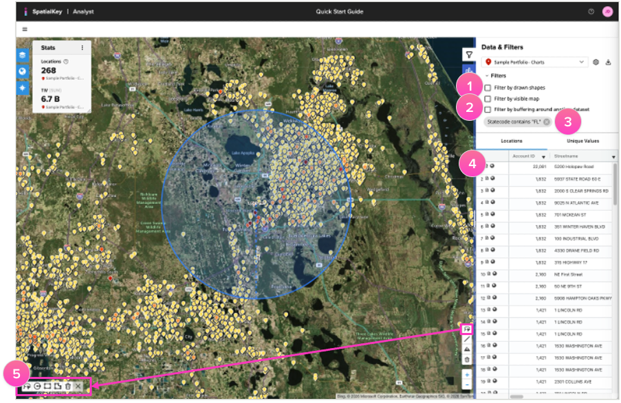
Custom shape filters have 4 different options:
5a) Use the freehand lasso tool to draw a custom shape around locations to filter your data.
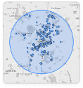
5b) Draw a circle to see how many locations fall within a certain radius.
5c) The rectangle tool can help you quickly calculate a perimeter.
5d) Use the polygon tool for irregular perimeters or to estimate square footage.
Application-Specific Filters
- Accumulations App:
- Filter by Accumulation Ring: Clicking an accumulation in the overview will take you to a filtered list and a zoomed-in map view of all locations that fall within that accumulation shape.
- Event Response App:
- Filter by Severity Band: Click on a severity band in the Summary Report (e.g., 64+ knots) to be taken to the map with the list filtered to the band you selected.
- Filter by Affected Locations: For Hurricane (NOAA & Kinetic only) and Wildfire analyses, a buffer of locations near the footprint are included in the analysis but filtered out by default. Toggling this checkbox off (located at the top of the location list panel) allows you to view those locations.
- Underwriting App:
- Filter by Hazard Bin: Click on a hazard bin in the scorecard report (e.g., High) to be taken to the map where you’ll find the list report filtered to the hazard bin you selected.
Was this helpful?