
What Is a Dashboard and How to Create One
A dashboard in SpatialKey is a saved mapping workspace that brings together your data, analysis, filters and settings in one place. It preserves the exact view and configuration you were working with—so you can reopen it later, share it with others, or use it as a repeatable setup for ongoing analyses. Dashboards make it easy to revisit important insights, monitor changes over time, and stay organized across different SpatialKey applications.
To create a dashboard, open the application you want to use from the Apps tab on your homepage (Analyst, Accumulations, Event Response, or Underwriting) and follow the on‑screen steps. In Analyst, you only need to select a dataset to generate a dashboard. In Accumulations, Event Response, or Underwriting, you’ll configure and run an analysis first, and the dashboard will be created automatically once the setup is complete.
Each application saves dashboards in one of two ways: automatically through the analyses you run—such as in the Accumulations, Event Response, or Underwriting applications—or manually when you choose to save your work in a multi‑purpose application like our flagship Analyst app. Once saved, your dashboard can be found in the Dashboards tab on your home screen.
Shared Dashboard Experience Across SpatialKey Applications
All SpatialKey applications are built on a shared mapping dashboard framework, ensuring a consistent and familiar experience across the platform.
Analyst is SpatialKey’s flagship application and is not tied to a specific workflow. It offers the full set of core dashboard features and serves as the baseline experience for working with spatial data, performing analysis, and exploring results through maps, charts, and tables.
Key Difference: Setup Screens
The Event Response, Underwriting, and Accumulations applications share these same core dashboard capabilities.
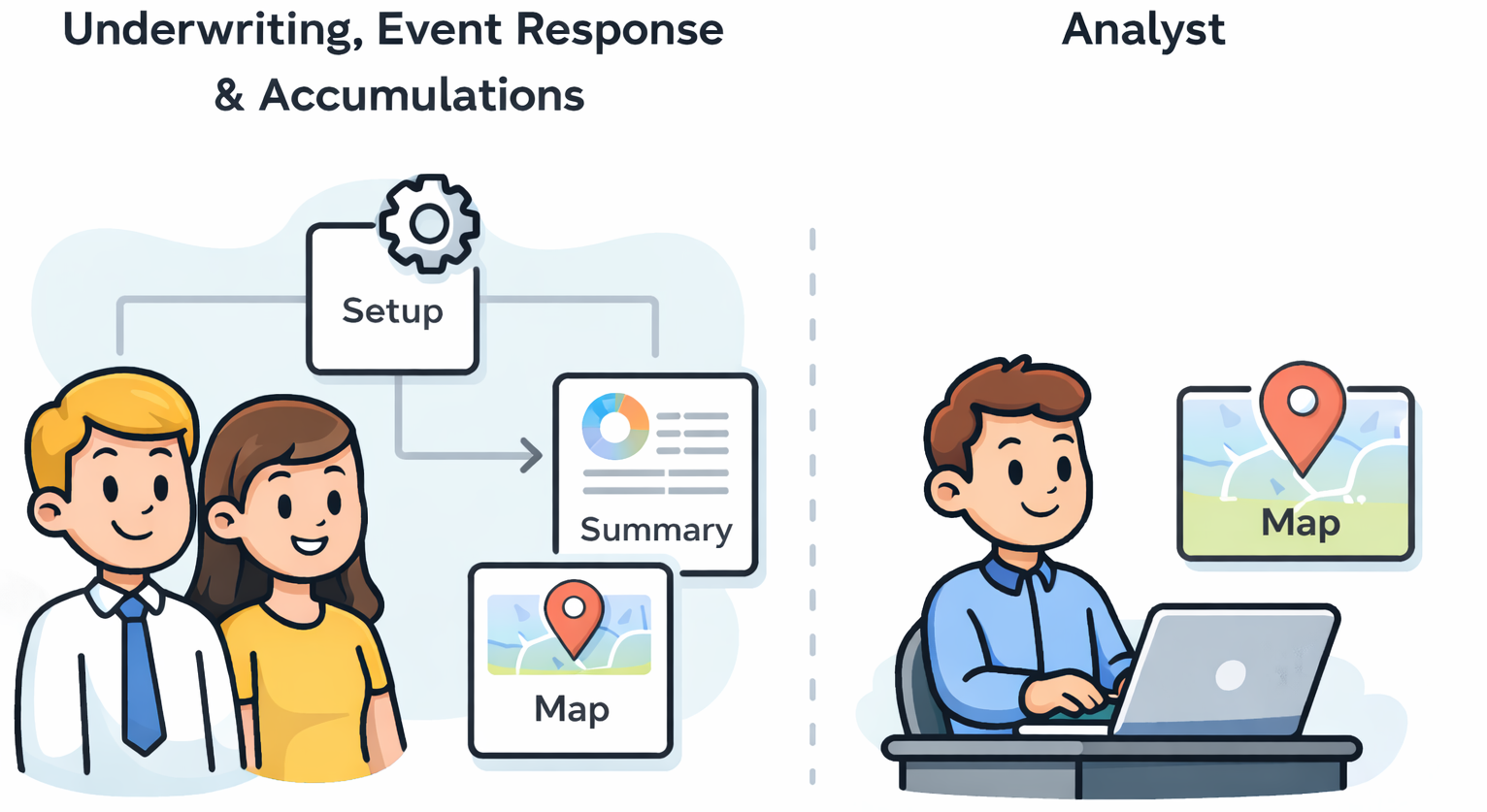
However, they have been extended with workflow-specific Setup Screens that guide users through application-specific inputs and configuration. These workflow‑specific differences were designed to accelerate the most common and time‑consuming analyses our users perform, automating much of the manual work and enabling faster, more consistent results.
The results are presented in a dashboard where most mapping features and interactions align with Analyst.
Key Difference: Summary Report
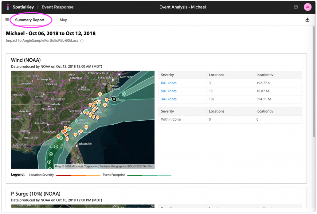
Another difference between these 3 apps and the flagship Analyst application is the inclusion of a Summary Report. After completing the workflow setup, users are first presented with this summary view, which provides a high-level overview of the analysis results. From there, users can seamlessly jump into the Map tab, which closely mirrors the Analyst dashboard experience.
The Summary Report is designed to give quick insight and context before diving into deeper, map-based exploration, allowing users to understand overall impacts, exposure, or results at a glance.
Application-Specific Enhancements
While the dashboard mapping experience is largely consistent across applications, there are a small number of exceptions where features have been built specifically to support a particular workflow. For example, Underwriting includes an Ad Hoc Lookup capability tailored to underwriting use cases. The Event Response application has a Dashboard Template feature that (for now) is specific to that application. Both Underwriting and Event Response also have Hazard layers associated with their analysis that are visible in the map views.
Outside of these targeted enhancements, users can expect a highly consistent experience once they are working within the mapping dashboard—making it easy to move between applications and leverage the same tools, interactions, and visualizations regardless of workflow.
Learn more about how to run analyses and create dashboards in the Accumulations, Event Response and Underwriting applications.
Shared Mapping Features
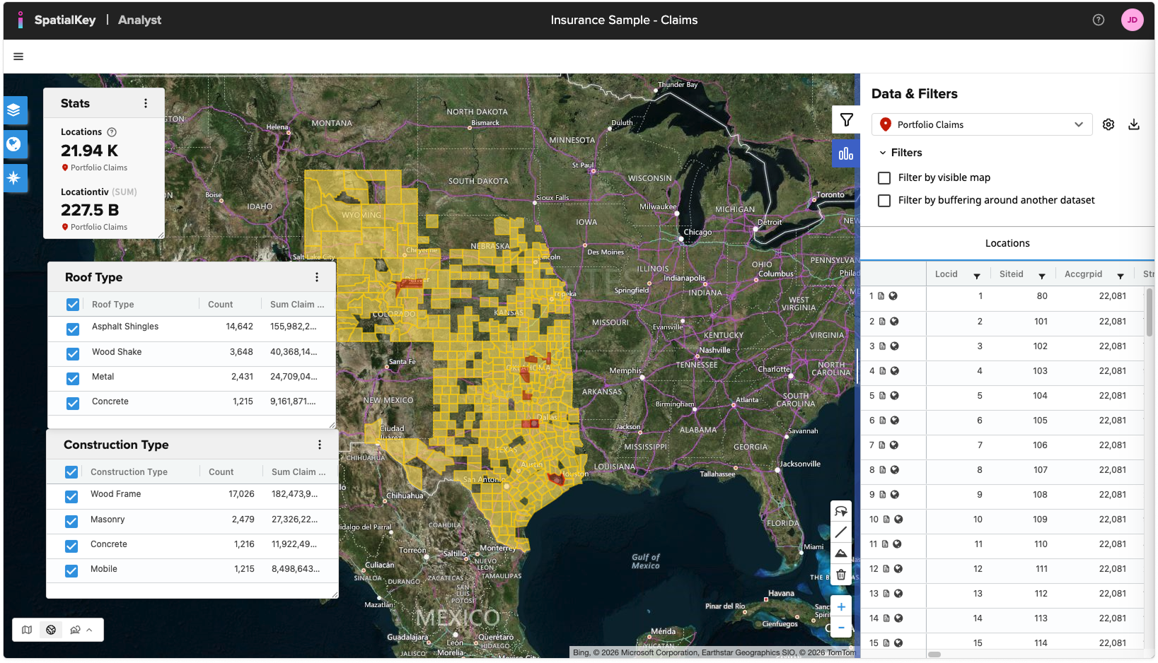
Let’s now take a look at some of those base mapping features you should expect across all applications. Open Analyst from the Apps tab, select a dataset and voilà, you’ve got a dashboard.
There are lots of ways to slice, dice and investigate your data. Let’s dig deeper into dashboard functionality:
- Layers: Control display of datasets, opacity, and click to view advanced visualization options.
- Map Layer: Control the base map and types like hybrid, street or black & white views.
- Legend: Interpret how each layer is visualized.
- Statistics Pod: By default, you’ll see the location count and sum TIV in the stats pod. Click the Charts icon in the right panel to add additional stats to your dashboard.
- Filters: Applied filters will display as chips or checkboxes.
- Locations: A list of all records in your data will display here along with the ability to filter at the top of each column.
- Policies: If you have a policy file joined to your locations data, a list of all policies will show here along with the ability to filter at the top of each column.
- Unique Values: Create a list of unique values to aggregate and filter your data by values like TIV or count of records.
- Map Tools: Measure distance, elevation and use drawing tools to filter your data.
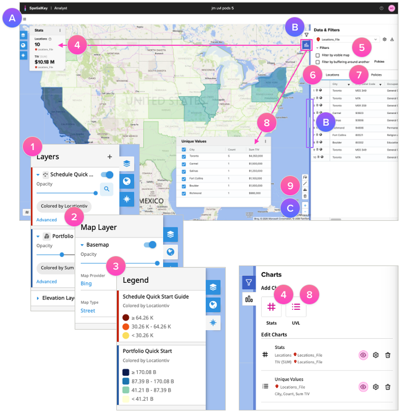
TIPs!
- A. Use the hamburger menu to access functions like create new or close a dashboard.
- B. Click the Filter or Chart icons to expand or collapse the view. Drag the blue vertical bar to resize the right panel and get a better view.
- C. Use your mouse to drag & pan the map. Use your mouse wheel or the “+“ & “-” buttons to zoom.
Was this helpful?