
When the Point visualization is selected, each location in your dataset is displayed as an individual symbol on the map, giving you precise, location-level insight.
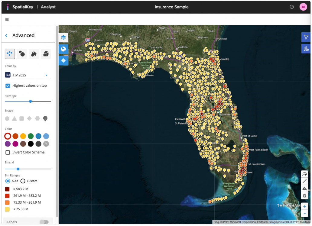
From the Advanced panel, you can control how points appear and behave:
- Color by: Choose a numeric or string field from your data.
- Highest values on top: Enable this option to display higher-value points above lower-value ones, ensuring the most important locations remain visible in dense areas.
- Size: Adjust the marker size using the slider to make locations more prominent or reduce visual clutter.
- Shape: Select from multiple point shapes (circle, triangle, square, diamond, pin, and more) to better differentiate datasets or match your visual preferences.
- Color & Color Scheme: Choose a color palette for your bins, optionally invert the color scheme, or apply a single color instead of multiple bins for a simpler view.
- Bins & Bin Ranges: Set the number of bins used to group values. With Bin Ranges set to Auto, SpatialKey automatically calculates value thresholds; switch to Custom if you want to define your own ranges.
Learn more about Color Settings & Bins.
Together, these options give you fine-grained control over how point data is visualized, helping you highlight patterns, outliers, and high-value locations on the map.
Individual points are just one way of visualizing your data on a map. In SpatialKey, we offer the following geographic visualization options – heat maps, graduated circles, individual points and thematic maps.
Was this helpful?
Thanks for your feedback!