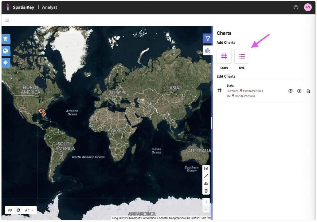
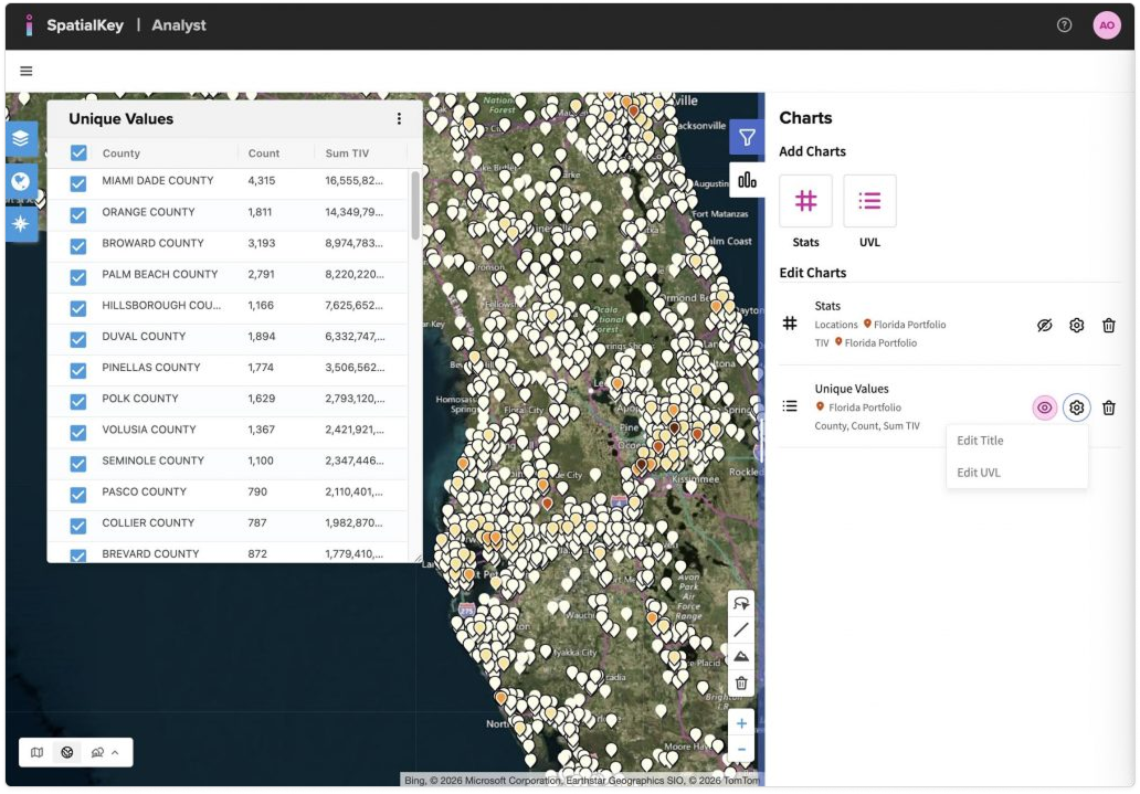
SpatialKey’s Unique Value List pod provides a list of all unique values for fields in your dataset.  Add a unique value list pod from the Charts panel on the right side of the map.

A map-based analytics interface showing a world map on a satellite base layer. On the right, a Charts panel is open with options to add charts. An arrow points to the ‘UVL’ button, indicating where users can click to create a Unique Value List. Existing chart options and controls are shown below, while map navigation tools appear around the map.
Add UVL from the Charts panel

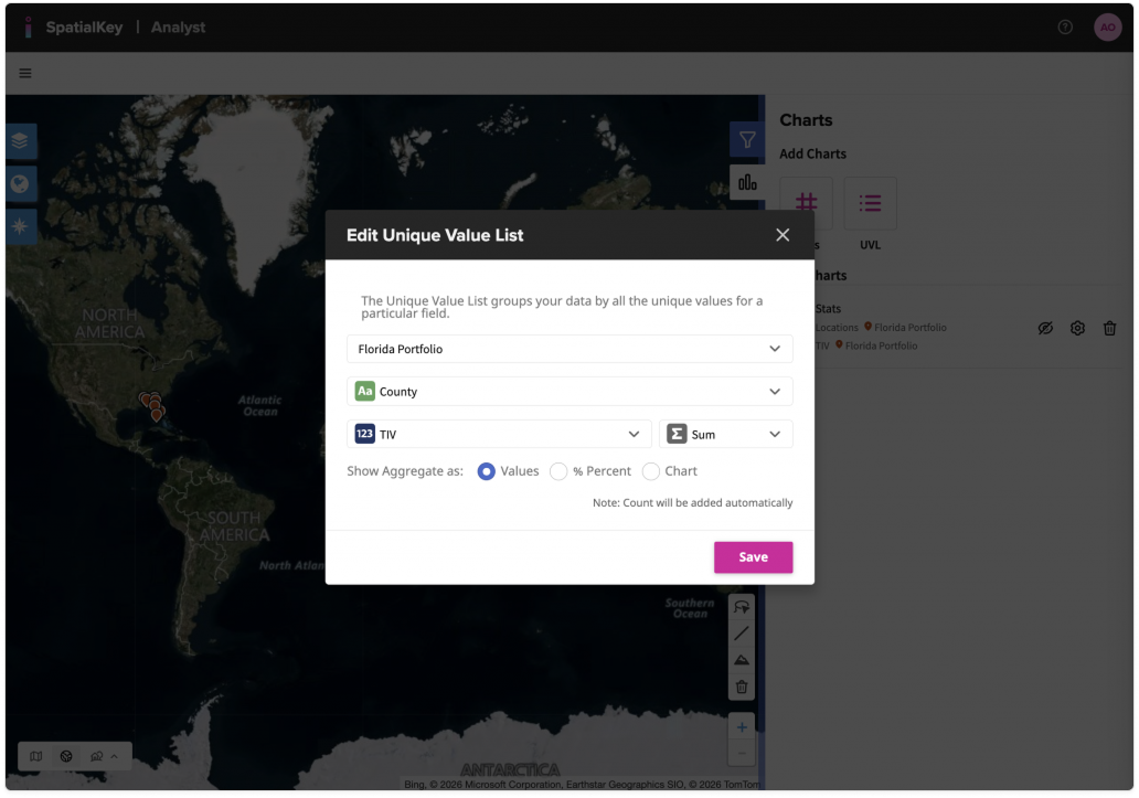
Select the dataset, the column to group your data by, as well as a numeric value for the calculation. You can show the aggregate as a value, percent or chart. Note: count will be added automatically.

A modal dialog titled ‘Edit Unique Value List’ displayed over a world map. The dialog shows configuration options for creating a Unique Value List, including selecting the Florida portfolio, grouping data by county, and aggregating total insured value using a sum. Options to display values or percentages are shown, with a Save button at the bottom. The map and Charts panel are visible in the background.
Select your dataset, grouping column and numeric value.

A map-based analytics interface showing Florida with numerous point markers over a satellite base map. On the left, a ‘Unique Values’ table lists counties with columns for count and sum of total insured value. On the right, a Charts panel shows a Unique Values chart configured for the Florida portfolio, grouped by county with count and sum of total insured value. The table and chart correspond to the mapped locations.
Example of a UVL Pod grouped by “County” and calculating the Sum TIV for each.

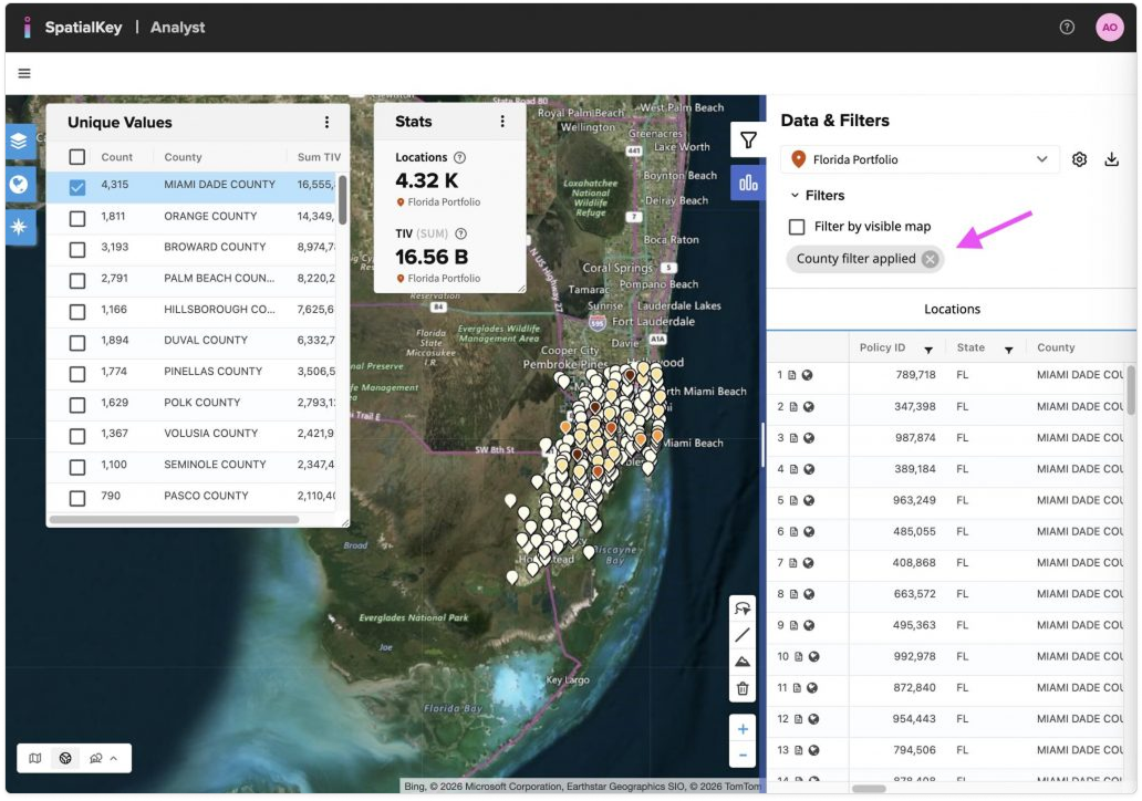
The Unique Value List can also be used to filter your data. Click the checkboxes individually to remove a row, or double-click a row to isolate just that row. You can also click the top checkbox to deselect or select all rows.

The data in your List Report and other Stats Pods will update to reflect the filter. To remove the filter, edit the Unique Value List or remove the Filter Chip in the right-hand List Report (see pink arrow below).

A map-based analytics interface showing Florida with clustered point markers on a satellite base map. On the left, a Unique Values table lists counties with count and sum of total insured value. On the right, the Data & Filters panel shows a filter applied, indicated by a chip labeled ‘County filter applied,’ with an arrow pointing to the chip. The chip indicates that the Unique Value List is filtered, and the filter can be removed by deleting the chip
Filtered UVL

To edit, export the data or remove the UVL pod, click the “…” menu in the upper right corner of the pod.

A map-based analytics interface showing Florida with clustered point markers on a satellite base map. On the left, a ‘Unique Values’ table lists counties with count and sum of total insured value. The three‑dot ‘more’ menu at the top of the Unique Values panel is open, showing options to edit the Unique Value List, export the data to CSV, or remove the Unique Value List. The Charts panel appears on the right with the active Unique Values chart.

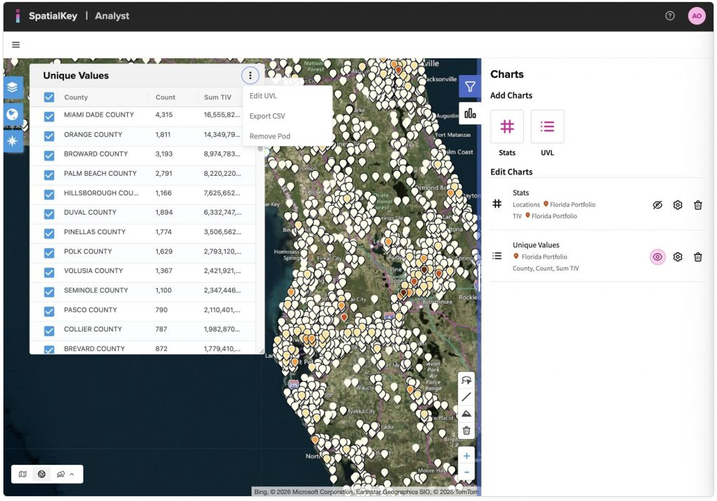
To hide, rename, or edit a UVL pod, use the controls in the Charts panel.

A map-based analytics interface showing Florida with clustered point markers on a satellite base map. On the right, the Charts panel displays a Unique Values entry for the Florida portfolio. Action controls next to the UVL allow the user to hide or show the pod, rename it, or open edit options. On the left, the corresponding Unique Values table lists counties with count and sum of total insured value.

Was this helpful?

Yes

No


Thanks for your feedback!

Tagged: