
Visualize and Understand Results
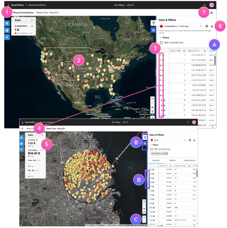
1. You’ll initially see an overview of your peak exposures based on the accumulation type selected. This view provides a high-level look at where to focus.
2. Use the map to visualize top accumulations, colored by exposure.
3. The list report shows a row for each accumulation and includes details like location count, closest city and distance, along with the metric you selected, and policy count.
4. Click the report icon in each row or on the accumulation point on the map to dive into an accumulation and see a zoomed in view of the accumulation along with a detailed list of all the locations, policies, and your total exposure.
5. At the top of the right panel, you’ll see statistics that summarize your accumulation. You can add custom stats to your report.
Download Results
6. Export a CSV list of the accumulation areas or export a shapefile of the accumulation results.
7. With our Advanced Export option, you can download a list of accumulation areas, a list of impacted locations per area and a list of impacted policies per area (if applicable).
TIP!
- A. To limit the data created by the advanced export, apply a filter to the overview list to focus.
- B. Click the arrows to expand or collapse the view. Drag the blue vertical bar to resize the right panel and get a better view of your data.
- C. Use your mouse to drag & pan the map. Use your mouse wheel or the “+“ & “-” buttons to zoom.
Was this helpful?